Curate
Branding·Identity·Art Direction·2026
Scroll
The Brand

For the man whose style never stands still.

Curate is made for men who treat fashion as a living practice, not a fixed look but a language they refine season after season. Dressing, for them, is a way to evolve, to try, to edit, to grow a little more themselves each time. The identity gives that instinct a home: a woven mark for the threads they bring together, and a calm, confident wordmark for taste that never needs to shout.

The Symbol

Four strokes, woven into one.

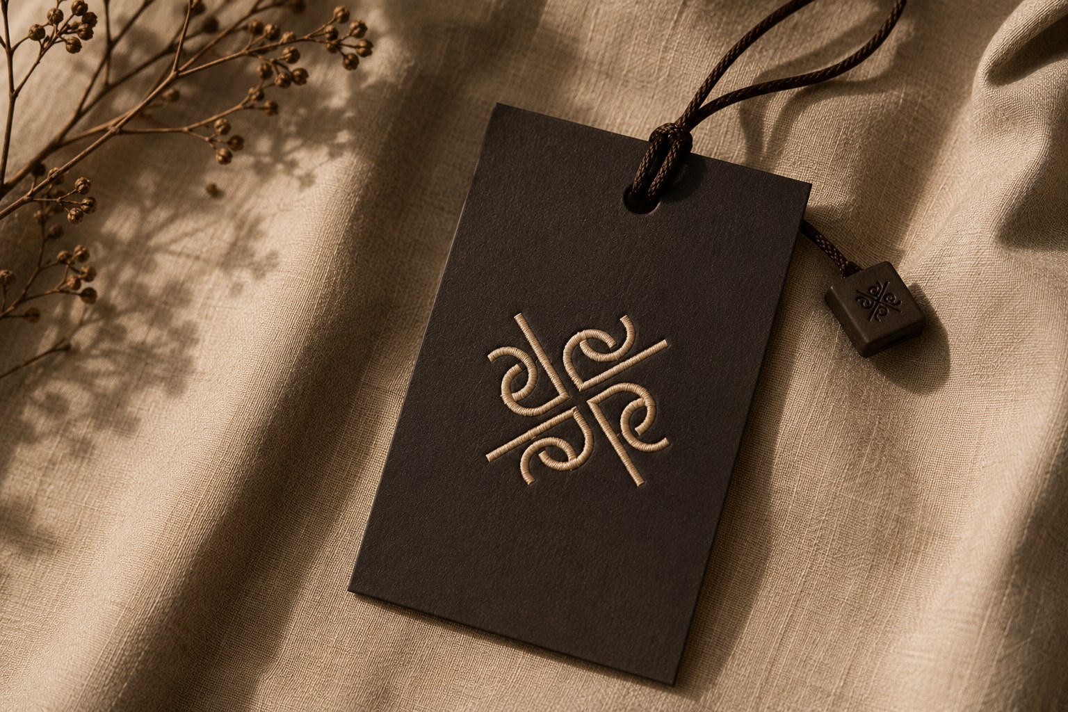
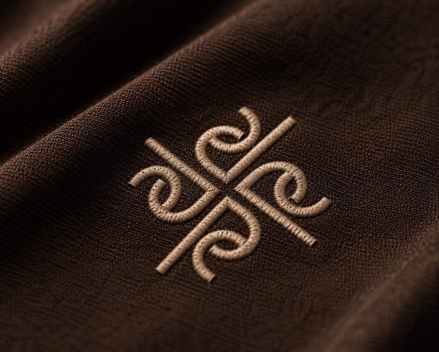
The mark is built from four mirrored, interlacing strokes that meet at the centre, a knot of curation where order emerges from motion. Fully symmetrical, it reads the same from every side and scales cleanly from a favicon to a facade.
The Logotype

A mark and a name, in quiet harmony.

Curate
On dark
On sand
On espresso
Palette

Two colours, light and shadow.

#D7BEA7Sand
#3A2213Espresso
3A2213 5A3B24 8A6A4E D7BEA7 EFE3D5
Typography

Classical letters, modern calm.

Aa
DisplayCurated with intent
HeadingCraft & composition
Body / GeistA quiet sans carries the functional text, letting the serif lead.
Imagery

Warm, tactile, unhurried.

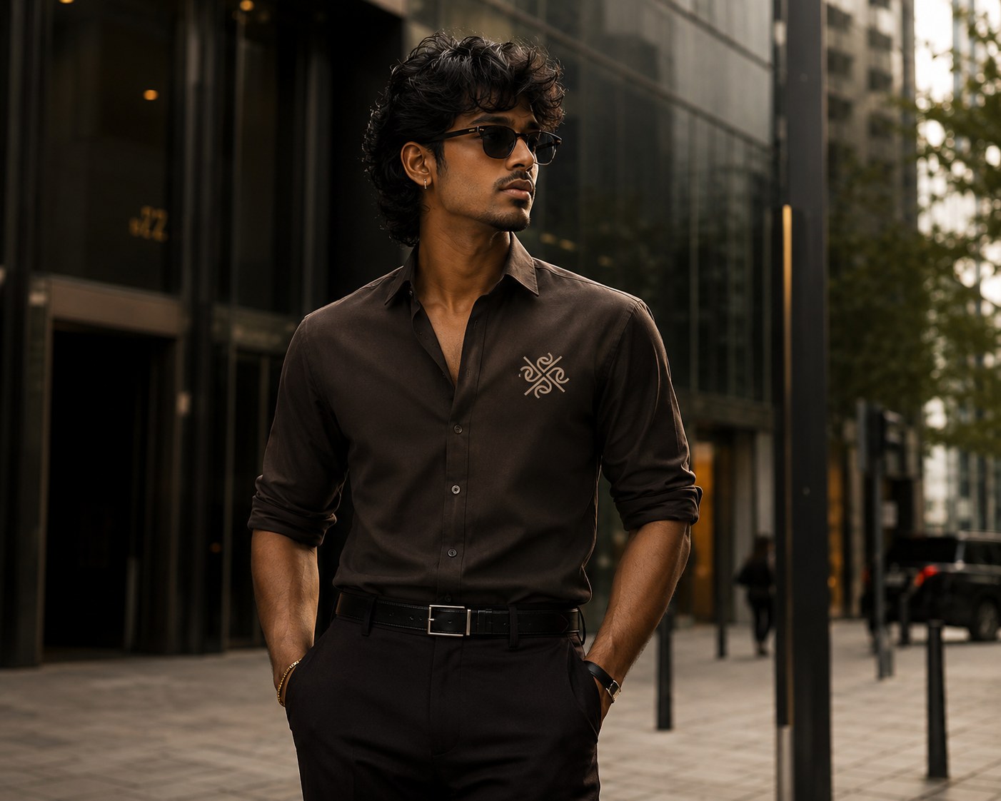
Curate identity, the mark applied
Brand photography01
Curate logotype detail
Detail02
Curate colour and type system
Texture03
In use

The system, applied.

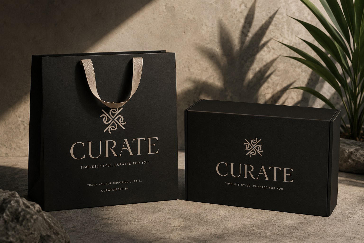
Curate identity across printed pieces
Collateral · packaging · signage04
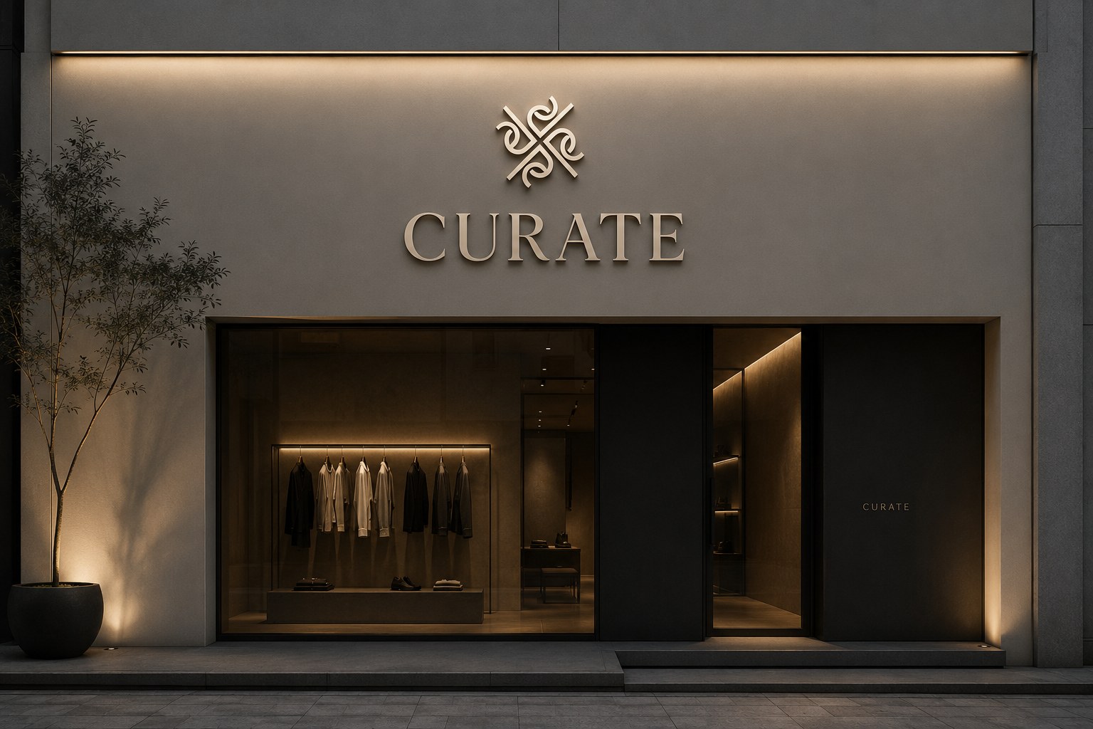
Curate brand applied in context
Environment05