02 · Mobile
Fintech app
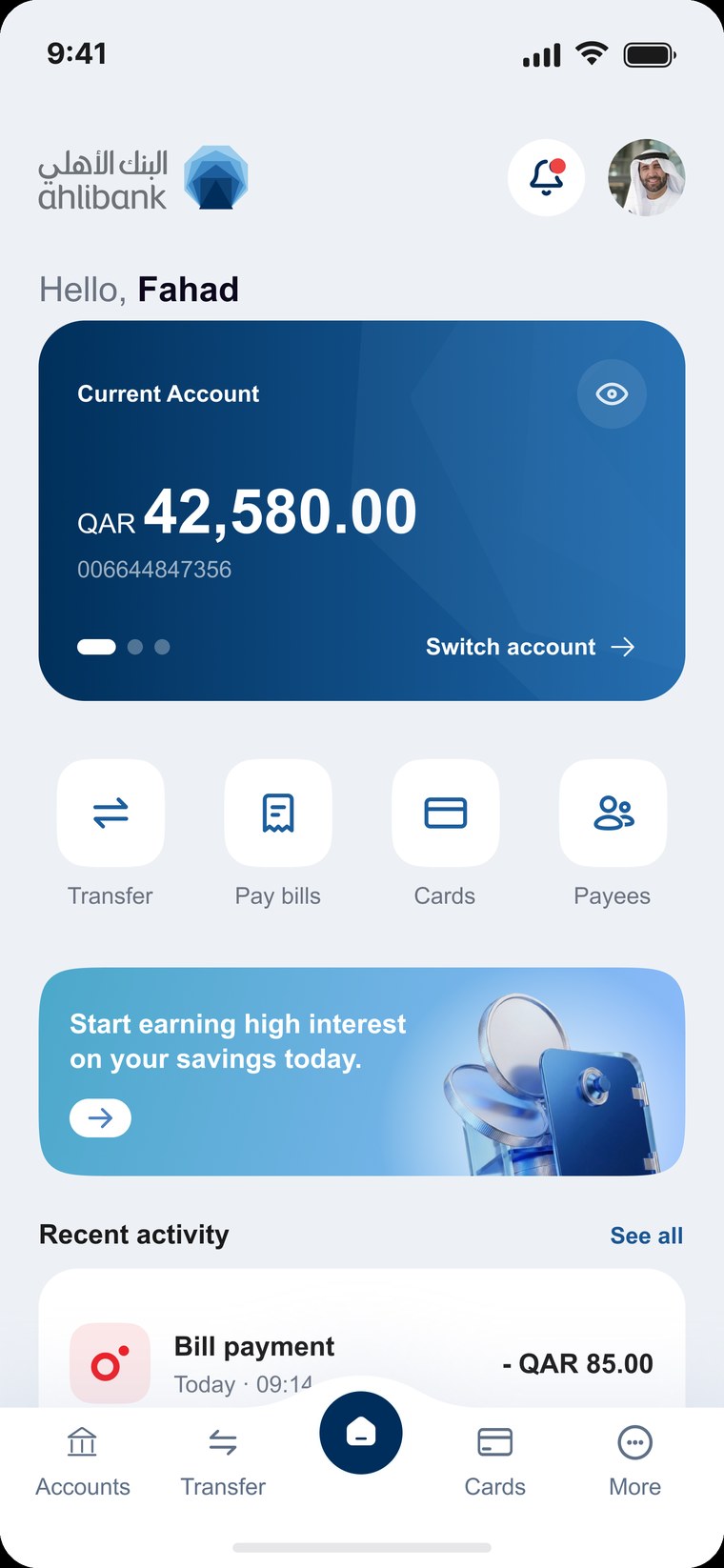
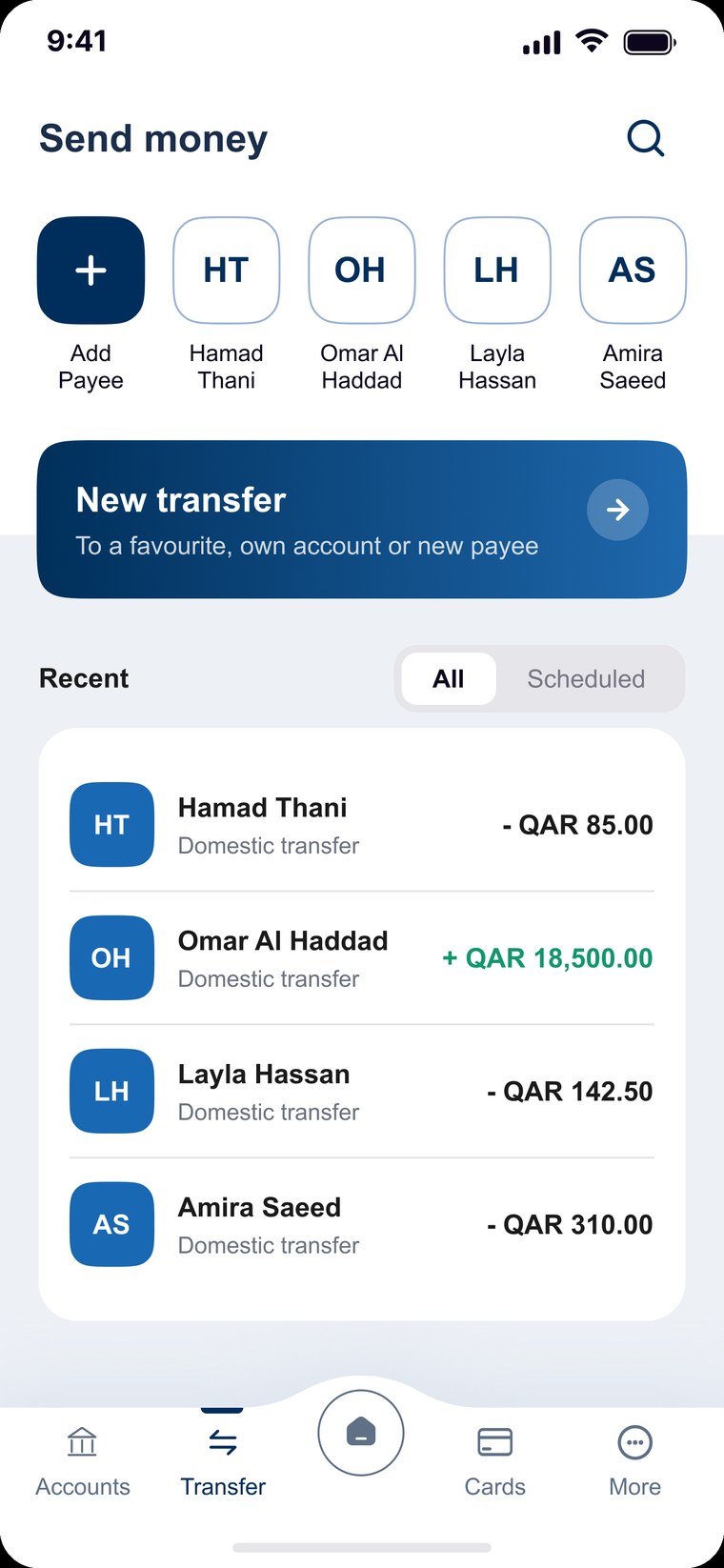
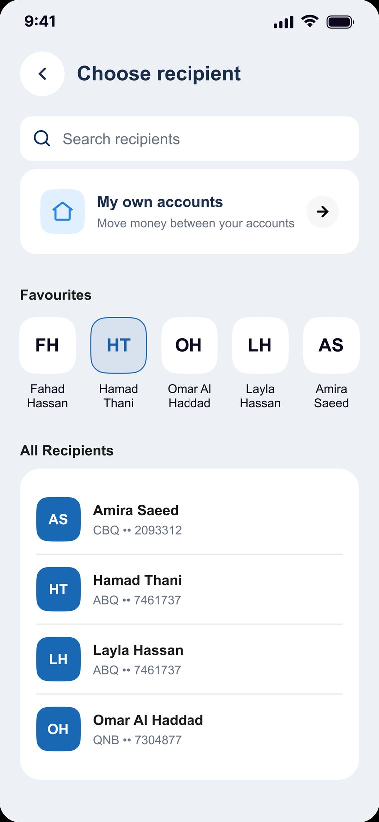
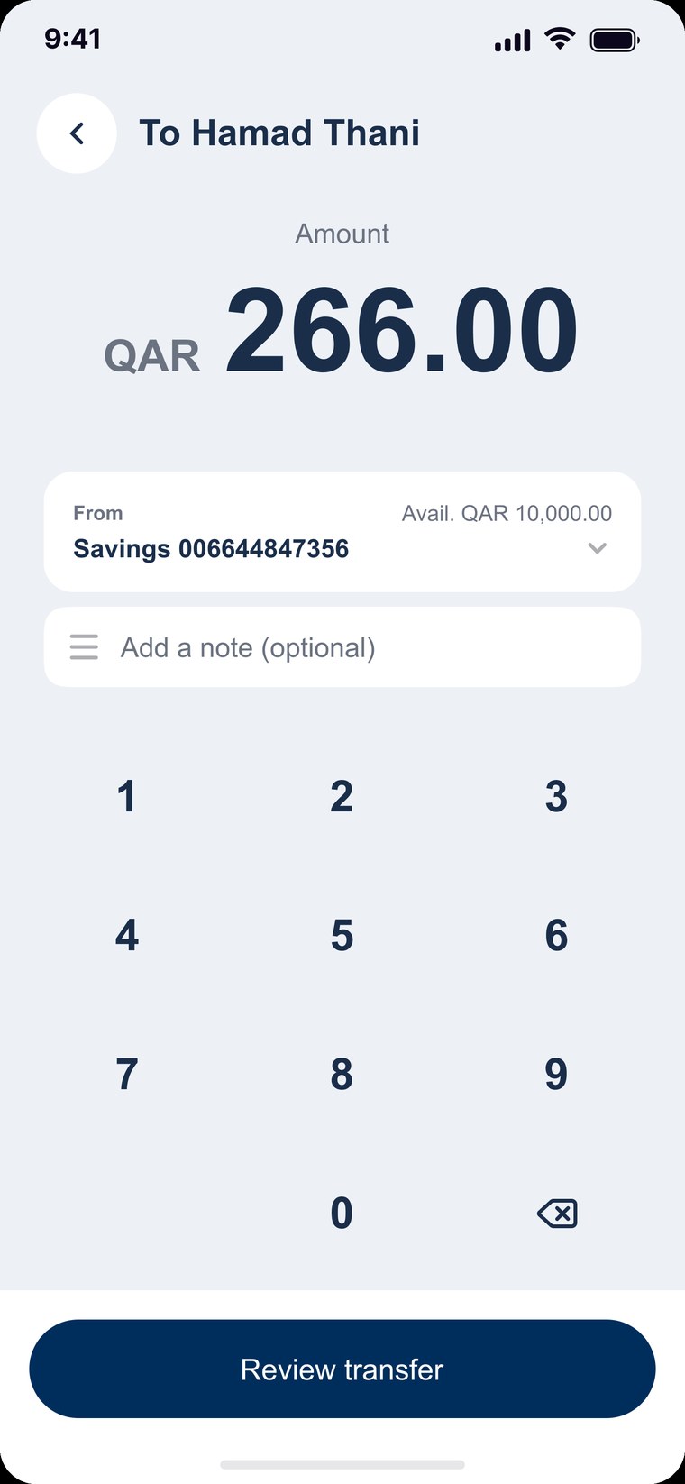
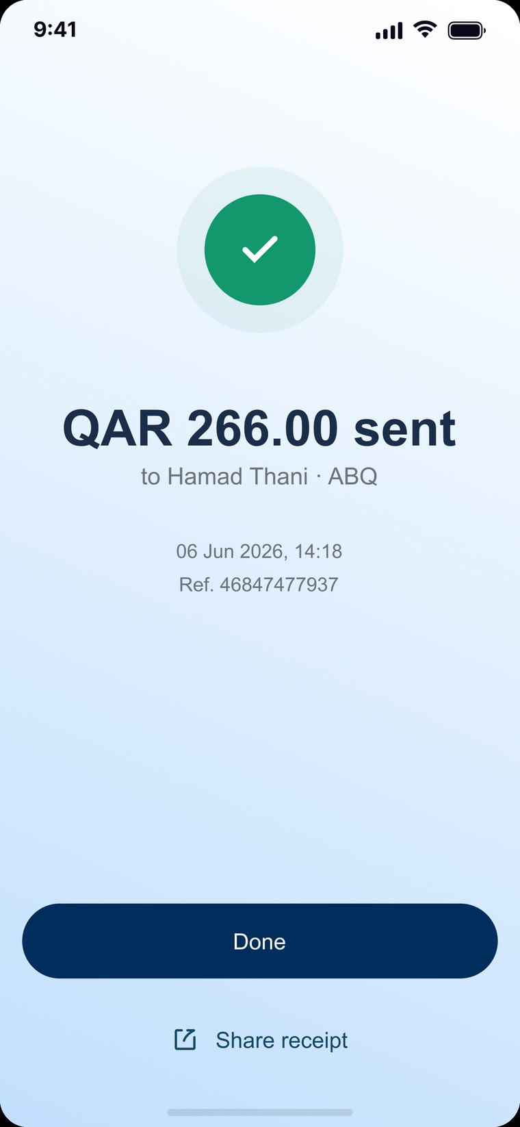
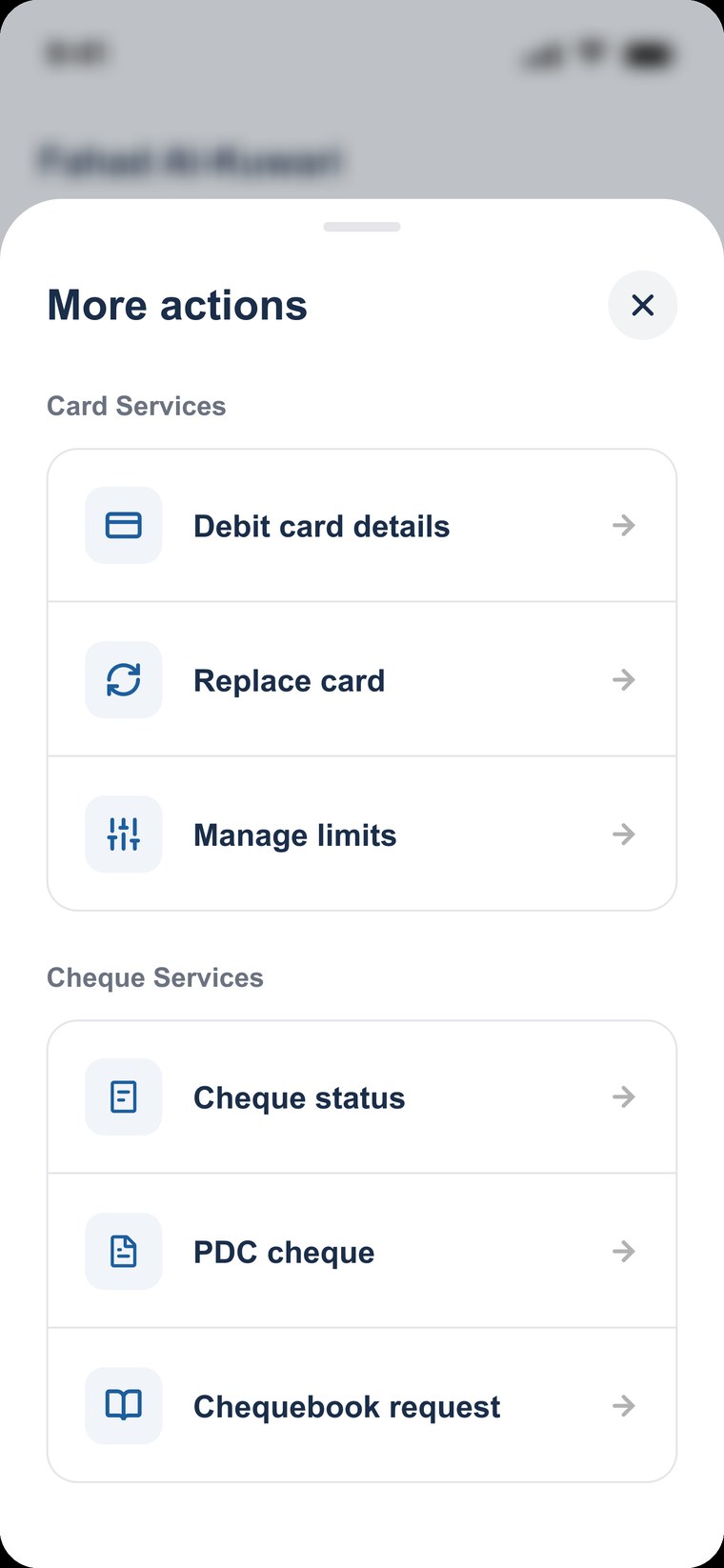
A wider look beyond the case studies: product & UI design, websites, branding, and a few things I coded for the fun of it.
A shopping experience for the fashion label Go Colors, built to help women explore and express their own style with ease. I blended a bright, feminine visual language with an intuitive path to buy, from browsing collections to a quick, confident checkout.
A full revamp of the Royal Sundaram insurance website, end to end across UX and UI. I restructured the journey around choosing and buying a policy, then rebuilt the interface into a clear, trustworthy system that makes insurance feel simple and human.
An identity for a streetwear label, built around one bold, rounded wordmark that holds up at any size. Black and off white throughout, so the mark does the talking across tees, tote bags, boxes, tags and woven labels.
Accessibility tends to get checked at the very end, when fixing it is expensive. So I built a plugin that does it while the screens are still open. Select frames, click once, and it audits them against WCAG 2.2 Level AA, then writes the whole report onto a new page in the same file: cover, objective, methodology, summary, and a detail page per screen with its snapshot.
Pass and fail are judged from measured data. Anything a machine should not decide on its own, like colour carrying meaning by itself or text sitting on a photo, is marked verify for a human to look at. It runs locally, so nothing leaves Figma. Designed and built with Claude, and I use it on my own work.
A platform for single family offices, the small teams that run one family's wealth. Famo pulls scattered holdings into a single view, so work that used to live in spreadsheets happens on screen. I designed the site to earn trust before it explains anything: a deep, quiet interface where the data visuals carry the story and every section answers one question, from the problem, to how it helps, to the family office that built it.